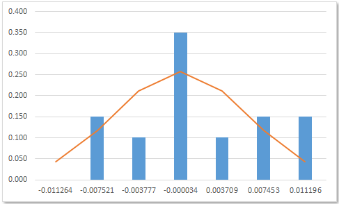
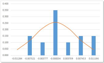
A histogram of stock returns with normal curve overlay
A histogram is a graphical representation of the frequency distribution of a set of data.
Part 1
Part 1 provides an introduction to frequency tables and histogram chart. The table is setup by counting bin values, then using the Excel Analysis Toolpak and finally, the Excel FREQUENCY function.
The Excel version is available in the Part 1 worksheet of the associated file.
1.1. Frequency table of the data from bin counts
We start with a list of stock prices and returns for a major Australian retailer over one month period for November 2012
(Figure 1). The daily closing prices Cprice are in column B, and the daily log returns LogR in column C are returned by the Excel LN function.
Descriptive statistics are shown in the range E7:F15. Each statistic is returned by an Excel function. A formula is used for the arithmetic Range statistic in cell F9.

In addition to the data summary provided by the descriptive statistics, an analyst might be interested in the number of returns above or below the average, or within plus or minus one standard deviation.
A frequency table tells us how often values occur in a table. In finance, it is often assumed that the stock returns series is normally distributed.
In this example, four bins are used to count the frequency values:
- Bin 1:
LogR≤ (μ - 1σ) - Bin 2: (μ - 1σ) <
LogR< μ - Bin 3: μ <
LogR< (μ + 1σ) - Bin 4: (μ + 1σ) ≤
LogR
To count the frequencies in the LogR vector (see Figure 1):
- Estimate the values for the frequency table bins (shown in the range
E17:F19). - Copy and Paste Special the log return
valuesin theLogRvector (to column I). - Sort the copied
valuesinto ascending order. - Count the frequencies (see column J).
This task can be more easily performed with the histogram tool from the Excel Analysis ToolPak
1.2. Histogram using the Analysis ToolPak
The Analysis Tools should be available on the Excel Ribbon under Data > Analysis > Data Analysis. If it is not there, then you need to install the Analysis Toolpak (ATP) AddIn.
To use the Histogram tool:
- Setup the values for the frequency table bins (see the range
K5:L8shown in Figure 2). This is an array formula linking the rangeE17:19from Figure 1. - On the Data tab of the Excel Ribbon, select Analysis > Data Analysis > Histogram to display the Histogram dialog box (see Figure 3)
- Complete the following properties (see Figure 3)
- Input
- Input Range: the LogR range from column C
- Bin Range: $L$6:$L$8. The bin label in cell
L5has been omitted. - Output options
- Output Range: the upper left cell of the target - $M$5
- Select (tick) - Chart Output
- Click the OK button

E17:F19 in Figure 1.
L5 was not selected.The output is shown in Figure 4. The output table (range M5:N9) has bin labels for the first three bins, whilst the last bin is given the default label of More.
The chart output option generates the column chart for the four bins. Its format can be edited as required.

The frequency table values in Figure 4 have no link to the source data. Each value in the range N6:N9 is a constant as shown by the formula bar entry for cell N6.
This means that the Histogram tool must be run each time the table or the chart need updating.
1.3 FREQUENCY function
The FREQUENCY function provides a way of linking the frequency table to the source data, and also allows use of dynamic tables and charts used in dashboard type management reports in Part 2 of this document.
The FREQUENCY function:
- Syntax: FREQUENCY(data_array,bins_array)
- Arguments
- data_array: an array of values from which the frequencies will be counted.
- bins_array: an array of intervals into which the values in data_array will be grouped.
To use the FREQUENCY function:
- Setup the values for the frequency table bins (see the range
K13:L16shown in Figure 5). - The FREQUENCY function is an array function. You must select the correct size range for the target, the return values. In this case the frequency vector is 4 rows by 1 column (4 x 1).
Select the range
M14:M17. - Enter the formula:
FREQUENCY(LogR,L14:L17), see cellM14in Figure 5. The empty cell atL17, corresponds to bin number 4, labeled More at cellL9in Figure 4. - Complete the formula by pressing Control+Shift+Enter.
- The frequency array is shown in Figure 6. Whilst the results are the same as those obtained previously, the FREQUENCY function array maintains links to the source data.

L17:M17 are equivalent to the More bin in Figure 4.
M14:M17.Part 2
In this part we extend the material from Part 1 to demonstrate an interactive analysis platform for a stock return distribution system with a normal curve overlay. The material is available in the Part 2 Analysis and Charts worksheet of the associated file.
2.1 A dynamic analyser of stock returns
The data used is a sample of share price data for the calendar year 2012, from the Australian retailer, Woolworths Limited, ASX code WOW. The data source is the Yahoo Finance web site, and the data has been imported to the WOW worksheet.
2.1.1 Setup the returns vector
To do this (see the range A:C in Figure 7).
- Insert a list of trading days for 2012 and the last day of 2011 (see range column
A). - In column
B, use the Excel VLOOKUP function to map the price data in the WOW worksheet to each date in the master list of columnA. The formula is shown in the formula bar. - In column
C, insert a vector of daily log returns using the Excel LN function. Be careful of the date vector direction.

2.1.2 Setup the stock analyser selection panel
The stock analyser selection panel is shown in the range E3:H7 of Figure 7. This provides an easy way to change the sample analysis date and number of observations.
The analyser selection panel cells link to the return data for the 2012 calendar year.
Firstly, the analyst selects an Analysis date (cell G5), then the length of the analysis sample is selected from the Sample (days) list (cell G6).
Satisfactory operation requires that the selection falls within the 2012 data window.
The year 2012 had 253 trading days, and suppose that the analyser permits a sample length (Sample (days)) of 20 to 90 trading days within this 1 year window.
The setup task is simplified with named ranges, and a Workarea of helper cells.
This means that the earliest analysis date (the furthest back in time) will be 11 May 2012. If 31 December 2012 is day 1, then 11 May 2012 is day 164, thus providing a maximum of 90 analysis days including 11 May 2012. [164 + 90 - 1 (because of the date common to both periods) = 253].
To setup the date vectors, create the following names:
- DateLong: RefersTo
='Part2 Analysis and Charts'!$A$6:$A$258. (253 rows). - DateShort: RefersTo
='Part2 Analysis and Charts'!$A$6:$A$169. (164 rows).
The range G5:G6 contains two data validation cells. To do add the Data Validation items:
- Select cell
G5 - On the Data tab of the Excel ribbon, select Data Tools > Data Validation
- Allow: List
- Source:
=DateShort - Click the OK button.
- Apply a date format to the cell.
- In the Workarea, set up a column vector
{20,21,...,90}. Name this vectorDayVector. - Select cell
G6 - On the Data tab of the Excel ribbon, select Data Tools > Data Validation
- Allow: List
- Source:
=DayVector - Click the OK button.
- Add the Names:
- Name: Analysis_Date
- RefersTo:
='Part2 Analysis and Charts'!$G$5 - Name: Sample__days. Note the double underscore occurs when you apply the Create from Selection item to the label
Sample (days). - RefersTo:
='Part2 Analysis and Charts'!$G$6
The stock analyser selector panel controls the dynamic vector named LogRVector. In turn the LogRVector
uses a nested vector named DateVector as one of its arguments. Here are the details:
Add the Names (several names are setup in section 2.2.3:
- Name: DateVector
- RefersTo:
=OFFSET(INDEX(DateShort,1,1),PositionTD-1,0,Height) - Name: LogRVector
- RefersTo:
=OFFSET(DateVector,0,2)
The argument names come from the labels shown in Figure 8.
2.1.3 Setup the stock analyser summary statistics
Other Names have been used in the range N6:O27 shown by the red border in Figure 8. The labels in column N has been applied as names to the values in column 0.
All cell formulae for the Workarea as shown in the shaded section P6:Q27 of Figure 8. The Holidays name refers to rows 31 and 32.

2.2 A dynamic histogram of stock returns
In this example, the dynamic histogram uses a fixed number of bins, but allows the intervals and bins widths to vary with the data. Optimal bin numbers and intervals is discussed in Cimbala (2013), Doane (1976) - Doane's formula, Scott (1979) - Scott's normal reference rule, and Sturges (1926) - Sturges' formula.
Given the assumption of a normal distribution in log returns, six symmetrical to the mean bins are used. Three below the mean, and three above the mean.
Remember that the bin_array argument to the FREQUENCY function is the upper limit to the values in a particular bin. So bin 3, labeled -1 in Figure 9 has an upper limit of Mu.
To achieve symmetry around the mean, we need to determine the Max{|Min - Mu|, |Max - Mu|}. This statistic is denoted m and is used to setup the bins values as shown in Figure 9.
We calculate the m statistic in cell Q35. The Excel ABS function returns the absolute value. The six bins are labeled {-3, -2, ... , -1} in column Q. The -4 bin is a place holder to achieve symmetry in the left tail of the normal curve.
The frequencies in column R use the same method as the FREQUENCY function table in Figure 6.
In column S, each frequency value is divided by the vector total to return the relative frequency.

Q), frequencies (column R), and relative frequencies (column S).2.3 The normal curve overlay
The values for the normal probability density function in column T of Figure 8 are returned by the Excel NORMDIST function.
The NORMDIST function:
- Syntax: NORMDIST(x,mu,sigma, cumulative)
- Arguments
- x: the value at which to evaluate the distribution function .
- mu: the mean or average of the distribution.
- sigma: the standard deviation of the distribution.
- cumulative: TRUE for the cumulative normal distribution function; FALSE for the normal probability density function.
To scale the frequency and bell curve values, the Relative Normal frequency is calculated in column U.
2.4 The histogram and normal curve charts.
Looking at Figure 8, the three area marked 1, 2, and 3 are the series for the charts in Figures 10, 11, and 12.
First item 2, the RelFreq, and 3, the RelNormal are graphed as an Excel column chart (Figure 10).

Then the item 2 series column chart is converted to a line chart (Figure 11).

Finally, the normal curve line chart is smoothed by selecting the series, then Format Data Series > Marker Line Style, then ticking Smoothed line.

Associated Excel file: histogramwithnormalcurveoverlay.xlsx
References
Cimbala, J.M., (2013), 'Histograms' Penn State University, Unpublished Manuscript.
Doane D.P., (1976), 'Aesthetic frequency classification' American Statistician, pp.181-183.
Scott D.W., (1979), 'On optimal and data-based histograms', Biometrika, pp.605-610.
Sturges H.A, (1926), 'The choice of a class interval' Journal of the American Statistical Association, pp.65-66.
- This example was developed in Excel 2010
- Revised: Friday 24th of February 2023 - 02:37 PM, Pacific Time (PT)
